Green Horizon Initiative
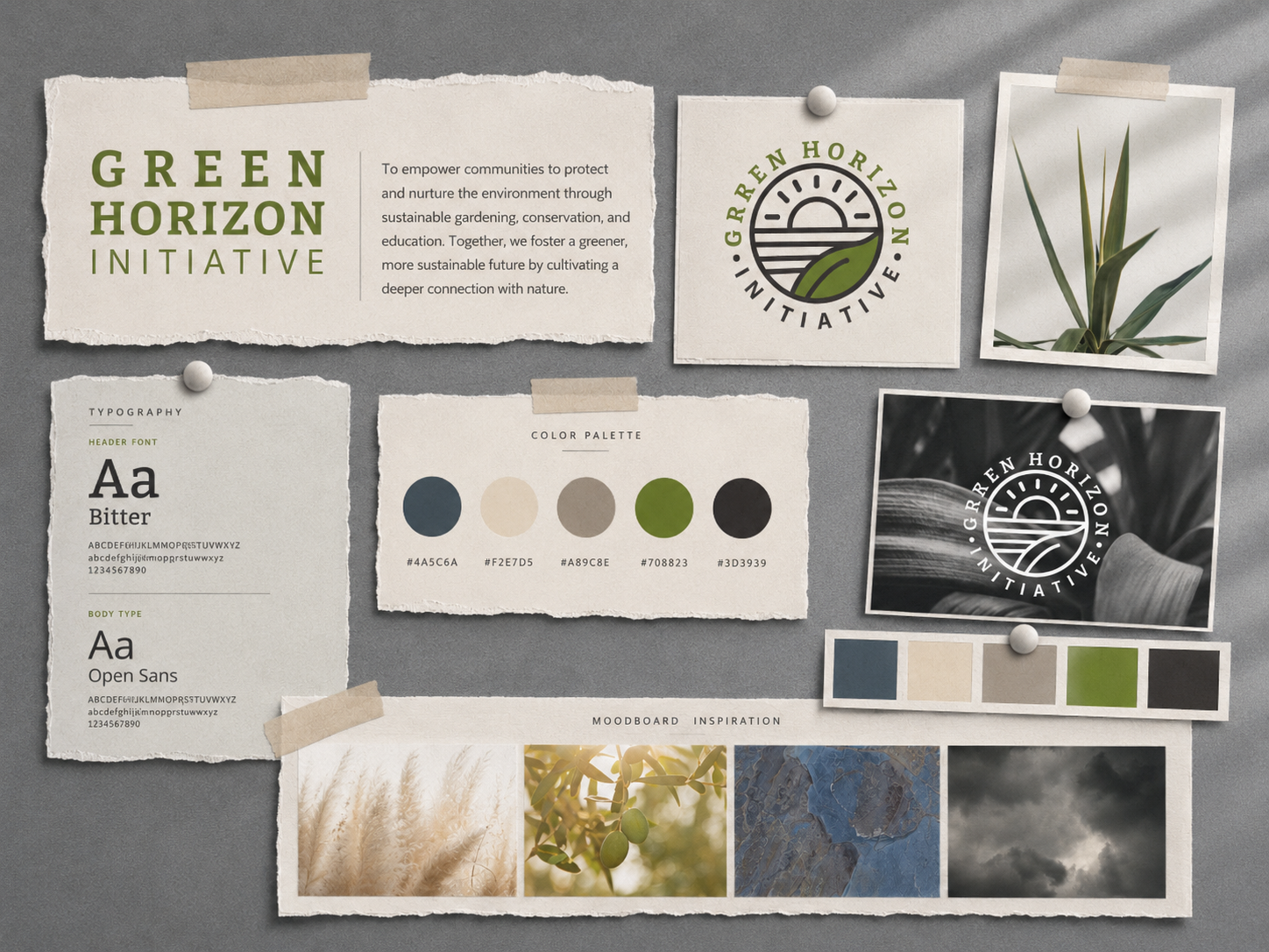
Green Horizon is a personal branding concept created to explore a fresh, environmentally inspired visual identity across multiple applications.
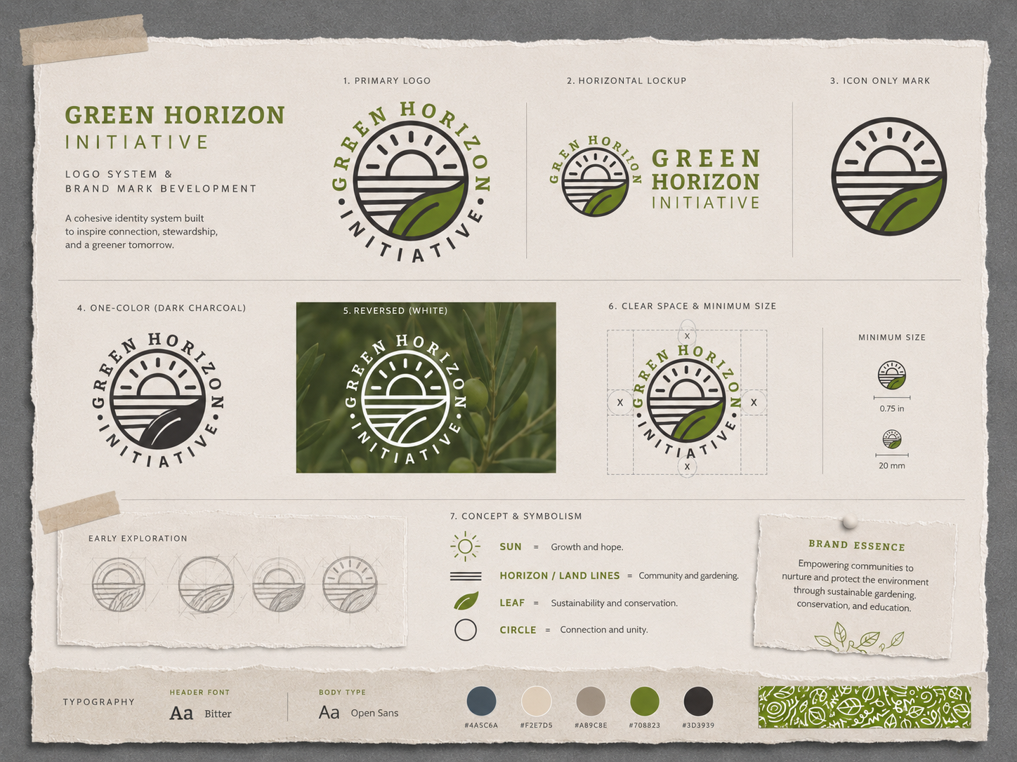
I developed the logo, color palette, typography, and supporting graphic elements, then carried the identity across a range of branded materials to create a cohesive and flexible visual system. The project focused on maintaining consistency while allowing the brand to adapt naturally to different formats.
Role: Brand Identity + Graphic Design
Tools: Adobe Illustrator, Adobe Photoshop
Deliverables: Logo, brand elements, patterns, and collateral
Focus: Visual identity, typography, color, and brand consistency
Tools: Adobe Illustrator, Adobe Photoshop
Deliverables: Logo, brand elements, patterns, and collateral
Focus: Visual identity, typography, color, and brand consistency
Brand Application
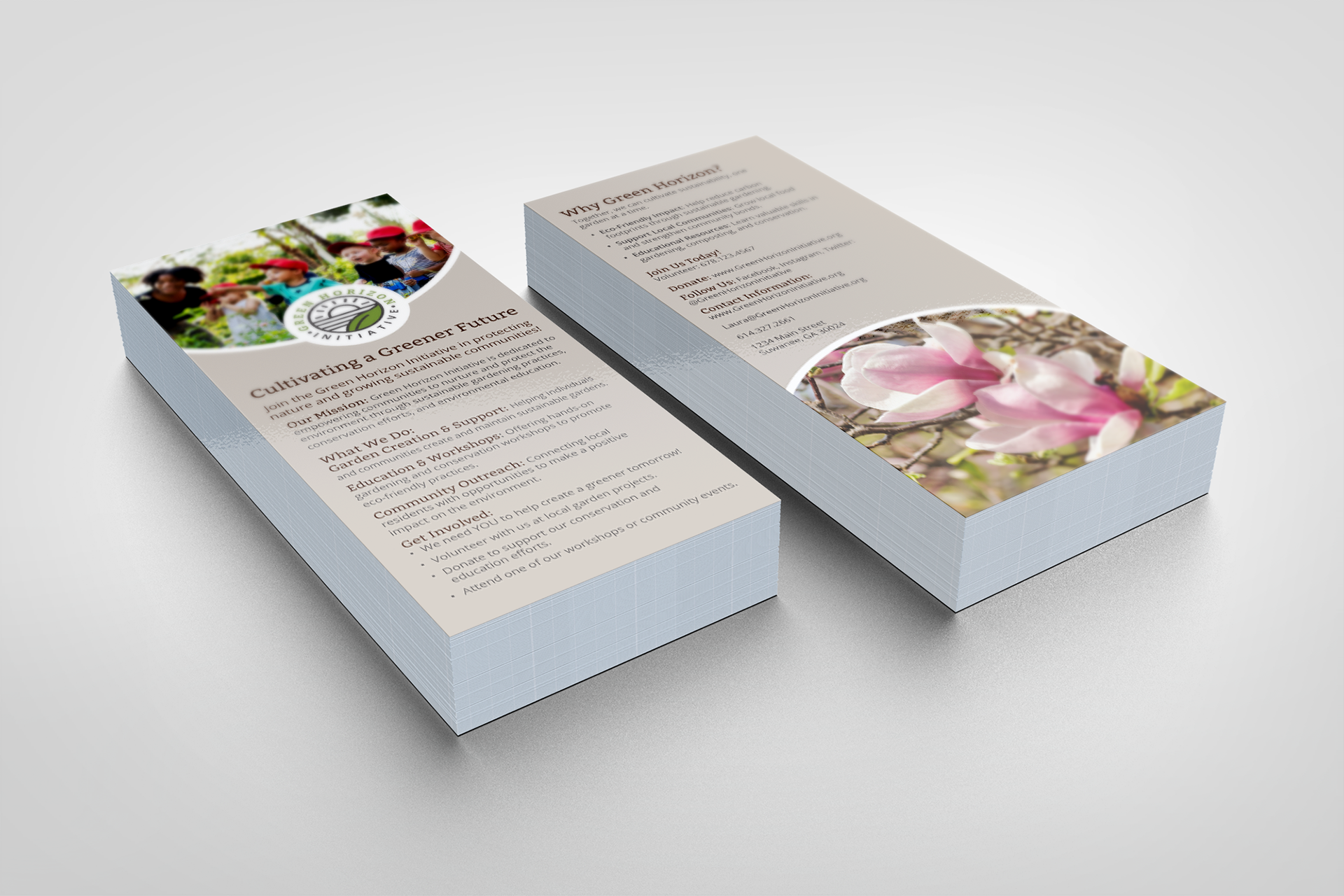
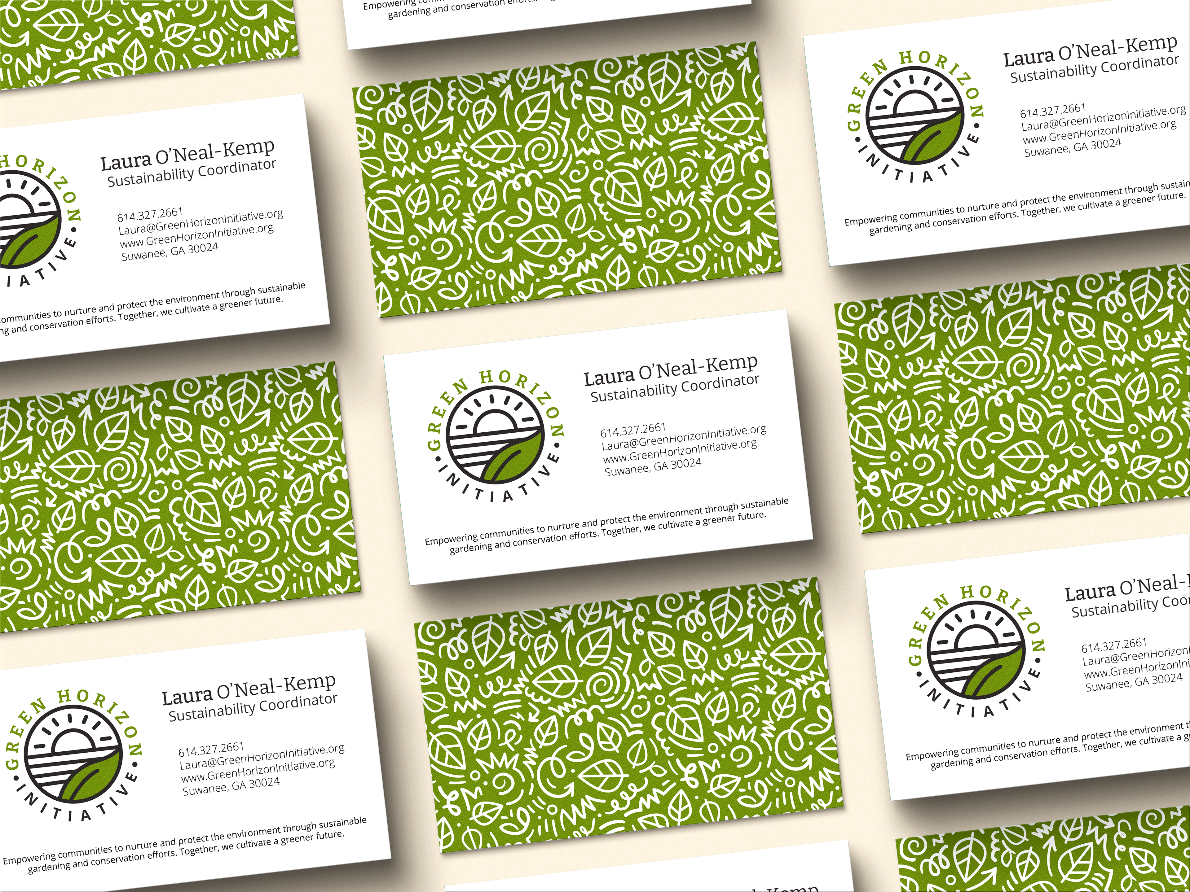
The final concept demonstrates how a simple identity system can expand across multiple touchpoints while maintaining a recognizable and cohesive look.